

Love London Living
A CASE STUDY
The Brief: To design a logo for a brand new London property company ‘Love London Living’.
Looking to establish a new logo / brand direction with a vibrant colour scheme we can take through into their Squarespace website design.
Full Logo wording: Love London Living
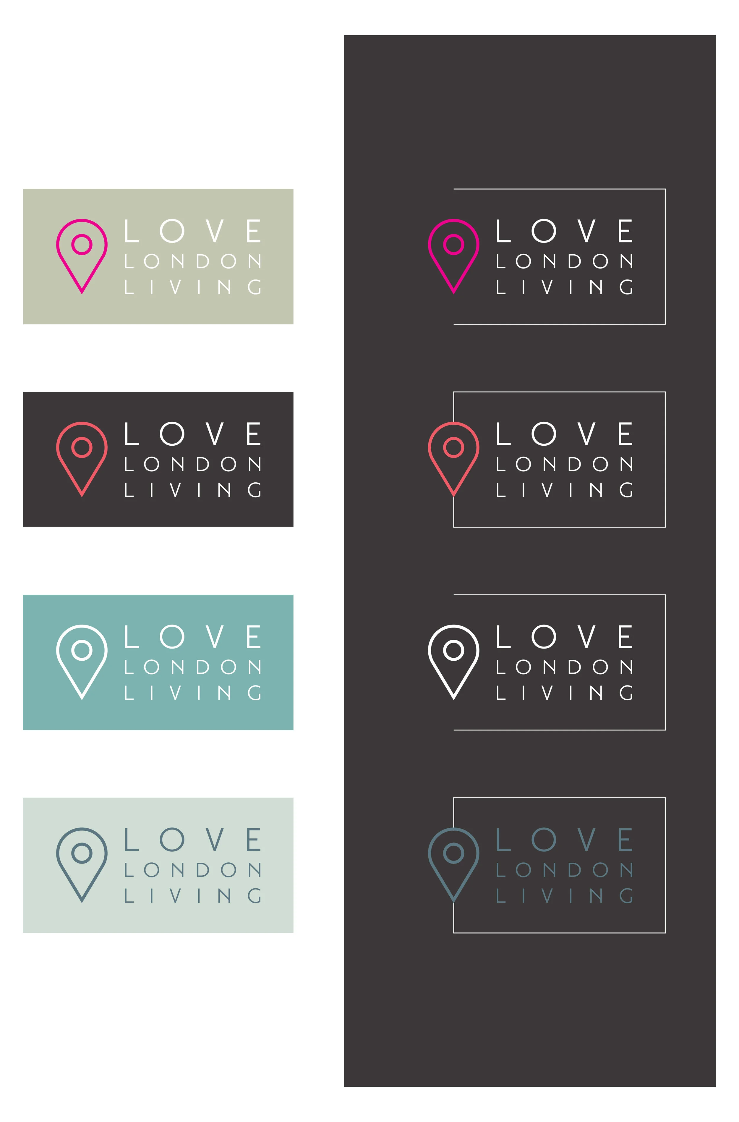
Example directions: Client’s feedback was “a preference for greys & pastel colours with a white font, straight and simple lines.
To begin with two initial directions, one including some sort of graphical element, perhaps a reference to a building or a house, and another purely typographical logo (no icon/illustration).
The logo would perhaps work with and without an illustrative element and we can perhaps supply a couple of variations, so for example on the website we could opt not to use the illustration or use this in the footer as a ‘signature’ element, but use the full version in the clients printed materials.”

Initial Sketches
Round 2 revision based on feedback
Final Logo

“Delighted with the website and logo design from Lift Creative. Sarah has been extremely helpful and knowledgable and understood exactly what I was looking for from day one. I would not hesitate to use Lift Creative again for any future projects and would certainly recommend them. Thank you again!”